

The ASKO Appliances UX & UI Evolution
Work
UX | UI | Research | Prototype
Design challenges
-

Inconsistency
Addressing inconsistencies in the interface design across the different appliances.
-

Adaptability
Navigating differences in display sizes and adapting to varying user interaction patterns.
-

Intuitiveness
Creating a seamless experience that balances innovation with familiarity.
Design evolution
-

Inconsistency → Unity
Achieving a consistent and cohesive interface design across all appliances to strengthen brand identity and user familiarity.
-
Adaptability → Flexibility
Designing interfaces that seamlessly adapt to various embedded UI display sizes without compromising functionality or usability.
-

Intuitiveness → Clarity
Simplifying navigation and interactions to create an intuitive and user-friendly experience for all users.
Background
For more than 70 years, ASKO has combined traditional Scandinavian design with state-of-the-art technology and innovation to create high-quality products that not only make life better but also better for people’s health and the planet. Design aims to develop a unified platform for the UI of three different types of appliances. The work presented unique challenges due to varying embedded UI display sizes and UX differences in user habits across the appliances.

Process
Empathize:
I conducted user interviews and surveys with our target group (affluent, well-educated women and men aged 30–60) who own ASKO products in their homes to understand their experiences with ASKO’s appliances. We received many responses by sending out the invitation letter to our beloved customers via sales distributors. We filtered the participants that fit into our personas to join the online interview session the one-on-one home visit and the group interview.


Starting with a home visit by interviewing ASKO appliances customer, to understand what is the user habit and pain points during the daily use of the machines. And following a group interview session to deepen the understanding of user behavior.
Users shared frustrations about learning different interfaces for each appliance and navigating complex features. They also emphasized the importance of intuitive designs and cohesive aesthetics in enhancing usability and brand perception. These insights shaped a user-centered foundation for the design process.

Define:
The research revealed key challenges: inconsistent interfaces created a fragmented experience, varying display sizes made navigation unintuitive, and the lack of uniformity diluted ASKO’s brand identity. Addressing these issues became the focus, ensuring solutions would resolve user frustrations while strengthening brand cohesion.

Ideate:
I organized a session with key stakeholders to address UI issues, categorizing them using affinity mapping to identify themes and priorities.

Together with the design team, we studied market competitor analysis, and brainstormed creative solutions, focusing on ways to simplify navigation and unify the brand experience. Initial concepts included consistent navigation patterns, clear visual hierarchies, and adaptable layouts for different display sizes.

Low-Fidelity design:
The phase began with rapid ideation using the Crazy 8 method, a brainstorming exercise designed to generate diverse ideas quickly. This approach helped explore various possibilities for solving key design challenges.

After gathering feedback from stakeholders and users, I refined the most promising ideas into a bit more detailed sketches - Low-fidelity wireframes. These initial drawings illustrated layout options and interaction flows for the laundry machine, dishwasher, and refreshment cabinet interfaces.


For further usability testing, I crafted a paper-cut machine prototype equipped with a tablet holder, the role of the tablet is to simulate the touchscreen interface. Using this setup, I tested early design concepts with an interactive prototype created in Adobe XD / Figma, allowing users to experience and provide feedback on the interface in a realistic context.
High-Fidelity design:
Refine the design and user flow through iterative improvements, guided by UX research findings and user feedback.

Outcomes
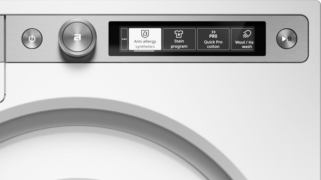
A simplifying navigation
and clearer hierarchy interactions system to create an intuitive and user-friendly experience for all users.
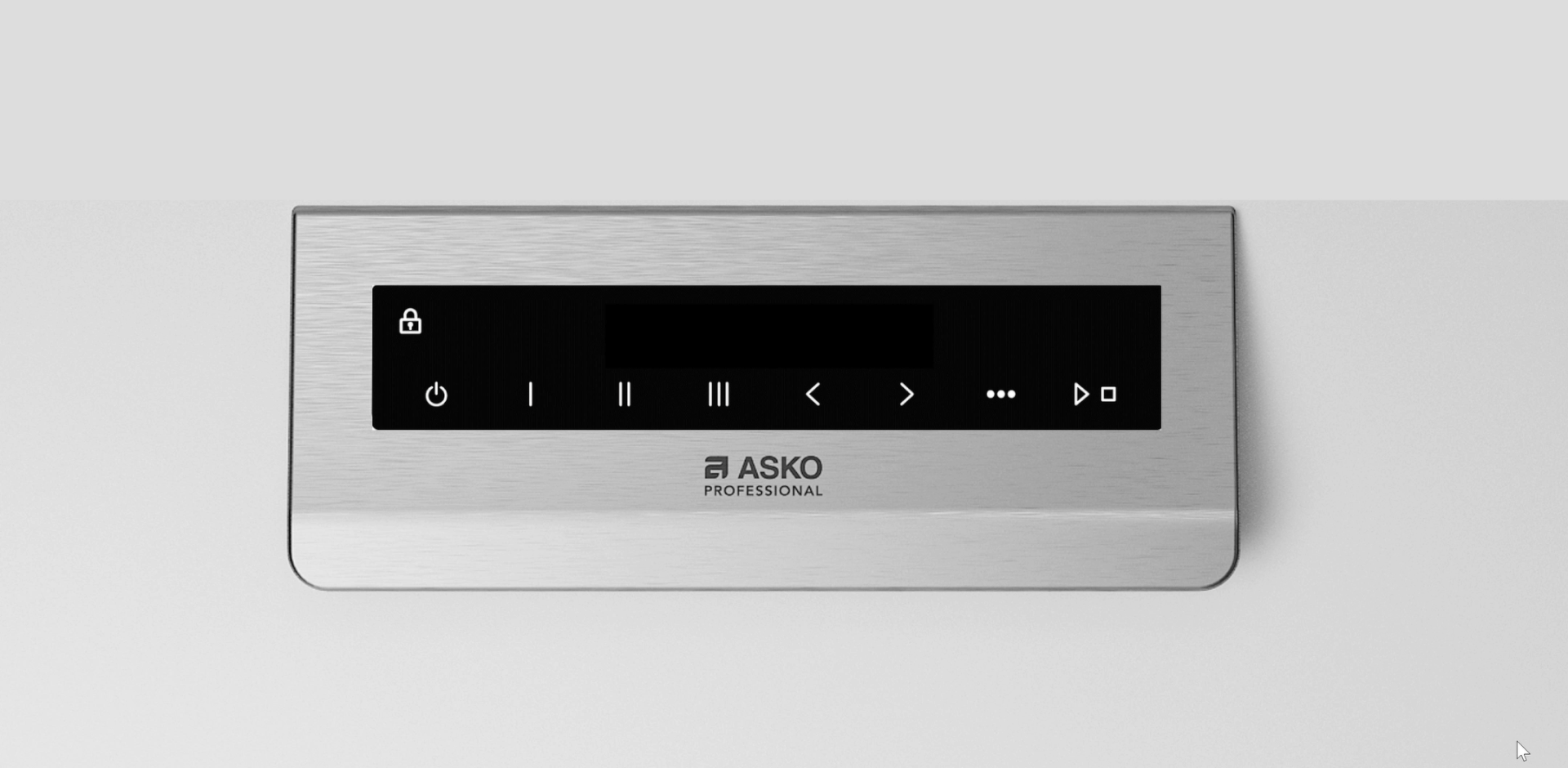
A cross-platform brand splash
seamlessly adapts to various embedded UI display sizes without compromising the aesthetic of Scandinavian northern light.
A consistent interface design guide
and cohesive icon system across all appliances to strengthen brand identity and user familiarity.


Extended reading: Design system
UI | Collaboration | Leadership